In the vast ocean of the business world, brands are like ships, navigating the tumultuous waters of market dynamics, consumer preferences, and technological advancements. But every so often, a ship must be refurbished, not just to repair its wear and tear but to redefine its very essence. This transformative process in the corporate world is known as rebranding. But what drives a company to undertake such a significant overhaul? Let’s embark on this exploratory voyage.
Understanding the Essence of Rebranding
Rebranding isn’t merely about changing a logo or adopting a new color palette. It’s a holistic process that touches every facet of a brand, from its visual identity to its core values and mission. It’s about redefining a brand’s narrative in a way that resonates with the current zeitgeist.
The Catalysts for Change
Several factors can propel a brand towards this transformative journey:
- Evolving Consumer Landscape: The modern consumer is not just a passive receiver; they are active participants, influencers, and critics. Brands like Domino’s tapped into this dynamic, listened to feedback, revamped their offerings, and witnessed a remarkable surge in market share. In fact, according to Statista, Domino’s global net sales increased from approximately 1.6 billion U.S. dollars in 2009 to over 4.1 billion U.S. dollars in 2020.
- Technological and Market Shifts: The digital age has ushered in rapid changes. Facebook’s metamorphosis into Meta is a prime example of a brand aligning itself with futuristic digital realms, specifically the burgeoning metaverse.

- Diversification and Expansion: As companies grow and diversify, their brand identity must reflect their evolved offerings. AirAsia’s color transition from red to green symbolized its broader, lifestyle-oriented offerings, subtly aligning with trends set by industry giants.
The Multifaceted Benefits of Rebranding
A successful rebranding can offer a plethora of benefits:
- Revitalized Brand Image: Brands, like chameleons, can adapt and transform to resonate with changing environments and audiences. Take Tupperware, for instance. Once, they were the kings and queens of home parties, where the latest in food storage innovations were showcased amidst friendly banter. But as the digital age dawned and consumer preferences shifted, these parties began to feel a tad outdated.
Recognizing the winds of change, Tupperware embarked on a transformative journey. They moved beyond just being a food storage brand. Their new mantra? Sustainability and inclusivity. The brand started emphasizing eco-friendly products, catering to the environmentally-conscious consumer. They also embraced inclusivity, ensuring their products catered to diverse lifestyles and needs.
But the rebranding wasn’t just about products. It was about perception. Tupperware introduced a fresh, modern look, shedding the image of a brand from yesteryears. Their new messaging, “Confidence Becomes You,” was a powerful statement, resonating with a generation that values self-expression and confidence. It’s a story of a brand that successfully navigated the delicate balance between honoring its legacy and embracing the future. - Penetrating New Markets: Rebranding can be the key to unlock new demographics. Discord’s transformation from a gamer-centric platform to a universal communication tool exemplifies this. Their user base grew from 45 million in 2017 to over 140 million in 2021.
Also read: Musk’s X Disables Key Feature: A Setback for Electoral Transparency?
The Inherent Risks of Rebranding
However, the path of rebranding is not always paved with gold. It comes with its set of challenges:
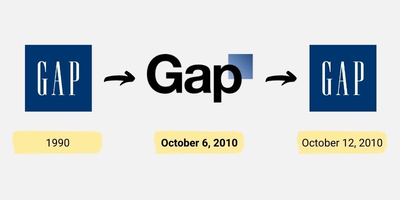
- Eroding Brand Equity: A drastic shift can alienate loyal customers. Brands must ensure that while they evolve, they don’t distance themselves from their core audience. Gap’s short-lived logo change in 2010 is a classic example. The backlash was so severe that the company reverted to its original logo within a week.

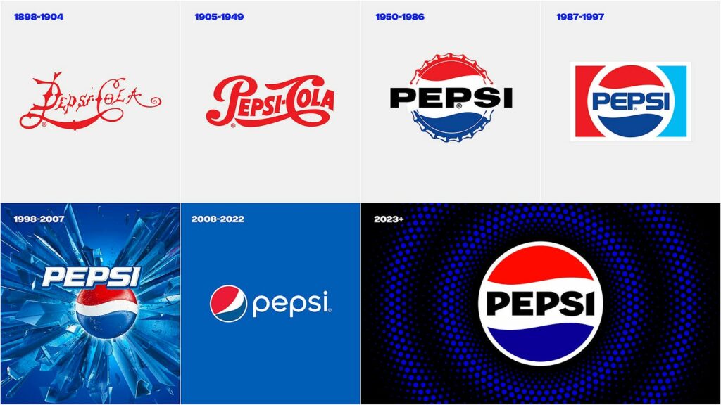
- Financial Implications: The costs associated with rebranding are substantial. From redesigning products to overhauling marketing materials and digital platforms, the expenses can be daunting. PepsiCo’s rebranding in 2008 reportedly cost them over a million dollars just for logo design.

- Potential Market Confusion: A significant rebrand can lead to confusion. If the transition isn’t smooth and well-communicated, consumers might feel disoriented. Yahoo’s logo changes in 2013, where they introduced a new logo every day for a month, left consumers and critics perplexed.

Case in Focus: AirAsia’s Rebranding Odyssey
AirAsia, once predominantly recognized by its fiery red hue, recently embarked on a transformative journey, adopting a fresh shade of green. This shift was more than just an aesthetic change; it was a strategic maneuver signaling its ambitious expansion into the digital realm.

The Backstory: AirAsia, founded in 1993, has been a dominant player in the low-cost airline sector. Its iconic red symbolized passion, determination, and the fiery spirit of a brand that aimed to make flying accessible to all. For years, this color became synonymous with affordable travel in the Asia-Pacific region.
The Shift to Green: The transition from red to green was not just about a color change. Green, in many cultures, symbolizes growth, harmony, and freshness. By adopting this color, AirAsia was subtly indicating its commitment to sustainable growth, environmental responsibility, and a fresh approach to its services.
Digital Aspirations: The rebranding was closely tied to AirAsia’s digital aspirations. The airline’s digital arm, AirAsia Digital, rebranded to “Move Digital,” emphasizing its commitment to becoming a comprehensive travel and lifestyle platform. The AirAsia SuperApp also underwent a brand refresh, renaming itself “AirAsia Move.” This transformation was not just about diversifying services but also about positioning AirAsia as a holistic lifestyle branding garnered mixed reactions. While many lauded the brand’s forward-thinking approach and its commitment to digital transformation, others felt nostalgic about the iconic red. However, the shift to green also aligned AirAsia with trends set by other industry giants in the ride-hailing and delivery space, such as Grab and Gojek.
Strategic Differentiation: One of the primary reasons behind this rebranding was to differentiate the digital arm from the core airline business. As AirAsia ventured into various sectors like food delivery, ride-hailing, and online shopping, it became imperative to have a distinct identity for its digital services, ensuring clarity for consumers.
The Broader Implications: AirAsia’s rebranding is not just about a change in color or name. It’s a reflection of the brand’s vision for the future. In an era where digital services are becoming increasingly integrated into people’s lives, AirAsia’s move signifies its intention to be at the forefront of this digital revolution, while also staying true to its roots as a trailblazer in the airline industry.
Also read: Dragonfly Pond Flourishes at Tropicana Golf & Country Resort: A Beacon of Biodiversity and Sustainable Control
Rebranding is a delicate dance between the past and the future. It’s about honoring a brand’s legacy while charting a course for its future. It requires a deep understanding of market dynamics, consumer preferences, and a brand’s core values.
In this ever-evolving business landscape, rebranding is not just a strategy; it’s a necessity. It’s a reflection of a brand’s evolution, its journey, and its aspirations. And as the corporate world continues to transform at a breakneck pace, one thing is clear: brands that adapt will thrive, while those that resist will fade into obscurity.


