


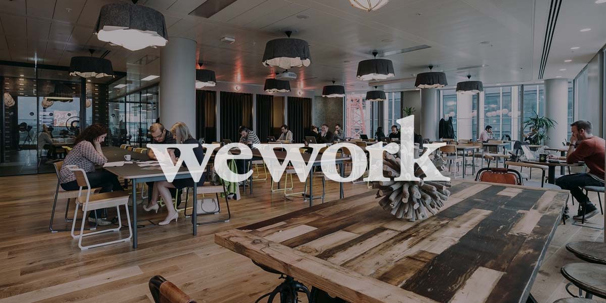
As we venture into a new era, the global coworking space provider, WeWork, has seized the opportunity to unveil its rejuvenated brand identity. This significant transformation is aimed at modernizing the company’s image while maintaining the essence that WeWork is known for.
In partnership with the renowned creative agency Franklyn, WeWork has revamped its brand from ground zero. The process encompassed various aspects, including a redesigned logo, a refreshing new color palette, hand-drawn illustrations representing individuals and workspaces, and a unique custom typeface expected to be omnipresent across all of WeWork’s platforms.
Patrick Richardson, the co-founder of Franklyn, shared his experience as a member of WeWork, lauding the “magic” one feels in a WeWork environment. He further explained that the inspiration behind the new visual identity is the unique blend of art and science, emotion and intellect, offered by WeWork, a fine balance that blurs the line between these aspects.
WeWork’s reimagined brand identity is not just about aesthetics; it is an experience that will permeate all the company’s digital, social, internal, and external channels. The seamless integration of the new logo and custom typeface with the existing brand will be evident during global asset updates. The new logo, a sophisticated blend of modernity and professionalism, retains the original’s subtlety, curves, and lowercase style, enabling a harmonious coexistence with the older version.
Also Read: Brand Mascots: Powering Emotive Connections and Defining Brands
Another notable aspect of the rebranding is the development of ‘WeWork Serif’, a custom typeface. The brainchild of a joint effort by A+ and Franklyn, this typeface serves as a visual bridge between the logo and text, ensuring brand consistency and instilling confidence in the users. Aperçu Pro, WeWork’s secondary typeface, has been chosen for body copy.
The rebranding focuses on illustrating the various ways WeWork members interact with their spaces. Hand-drawn illustrations add a human touch and display the range of product offerings and amenities, symbolizing the brand’s commitment to empowering individuals, teams, and organizations in crafting their perfect workday. WeWork’s photography style will also expand, capturing the art and science behind the carefully designed workspaces, the human element within them, and how members utilize the spaces.
WeWork is among the brands that have decided to embrace a fresh and modern identity this year, joining the likes of Fanta, which recently underwent an energetic and vibrant rebranding. This comprehensive rebranding is a testament to WeWork’s commitment to continuous evolution and adaptability in a rapidly changing business landscape.
We would love to hear your thoughts on WeWork’s new rebranding.